Client Brief: "We need to move more boxes online. Our existing site feels generic. We have incredible stories about our beans and techniques, but no one sees them."
Core Constraint: The client used Shopify. Heavy customization was off the table. We needed to work within a rigid framework.
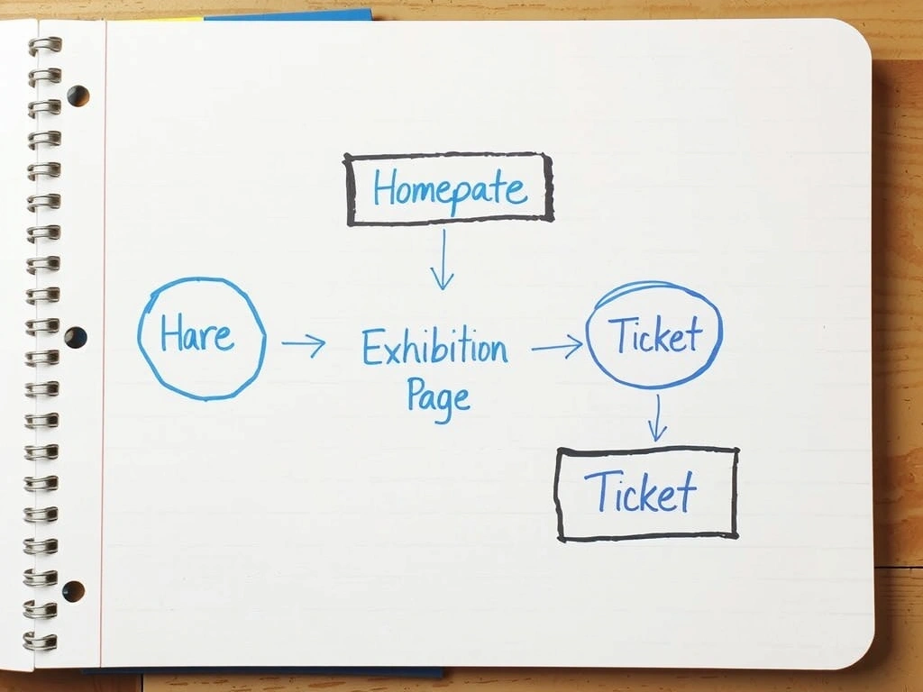
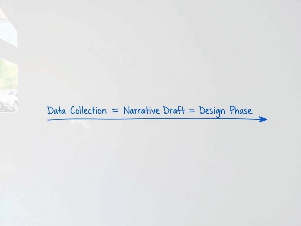
Discovery Deliverable: We mapped the "Customer Journey to Purchase" in three stages: Inspiration, Education, Transaction. We identified the "Provenance Story" as the key differentiator at the Inspiration stage.
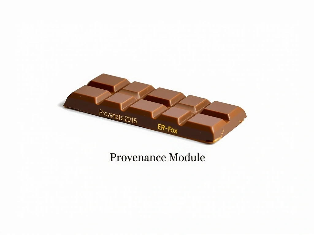
Key Decision: Instead of forcing the story into product descriptions, we built a "Provenance" content block that lives between the hero image and the 'Add to Cart' button. It pulls supplier data and narrative from the CMS and displays it in a rich, visual format.
Technical Stack (Shopify): Custom Liquid template for the Provenance block. Connected to a Shopify collection for supplier profiles. Used existing product metafields to avoid data migration.
Outcome Metrics: Path to purchase: 7 clicks → 2 clicks. Add-to-cart rate: +40%. Time on site: +2.5 minutes. (Data from 90 days post-launch, comparing similar traffic segments.)